From Sketch to Screen: How I Built My Butterfly Collection
There’s something about butterflies and why I keep going back to them for inspiration. The symmetry, the way the wings are both intricate and graphic at the same time. As someone who works in illustration, natural forms like these are a constant source of inspiration for me. They’re already doing so much of the design work on their own.
This collection (three butterflies) came out of that pull. I wanted to see what happened when I brought my visual language to something so inherently detailed. Here’s how it came together.
Starting With What Draws You In
Before I even begin to open Illustrator or put pencil to paper, I spend time just observing. For this collection I went deep on reference, not to copy, but to understand. Wing structure. How markings distribute across the surface. The way certain species have this almost geometric patterning built right into their biology.
What struck me most was how much natural variation exists between species. A Morpho butterfly and a Monarch are completely different visual experiences. One is all iridescent shimmer and smooth form, the other is graphic and high-contrast. That difference became the foundation for building a collection rather than a single piece. I knew immediately I wanted three, and I wanted them to feel related but distinct, like they belonged in the same world without being copies of each other.
Simplifying Without Losing the Soul
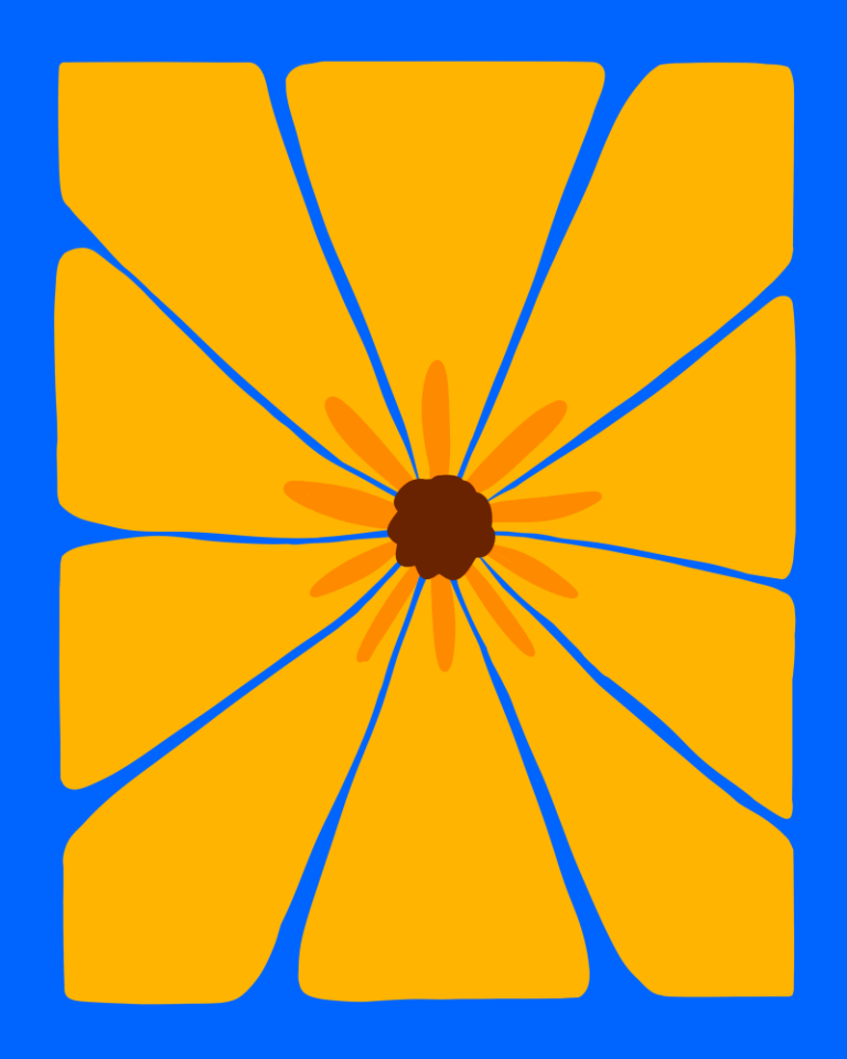
My illustration style is focused on flat 2D illustration, I’m drawn to bold shapes, limited detail and graphic lines with a focus on complementary colors. The challenge with something as intricate as a butterfly is knowing what to keep and what to let go of.
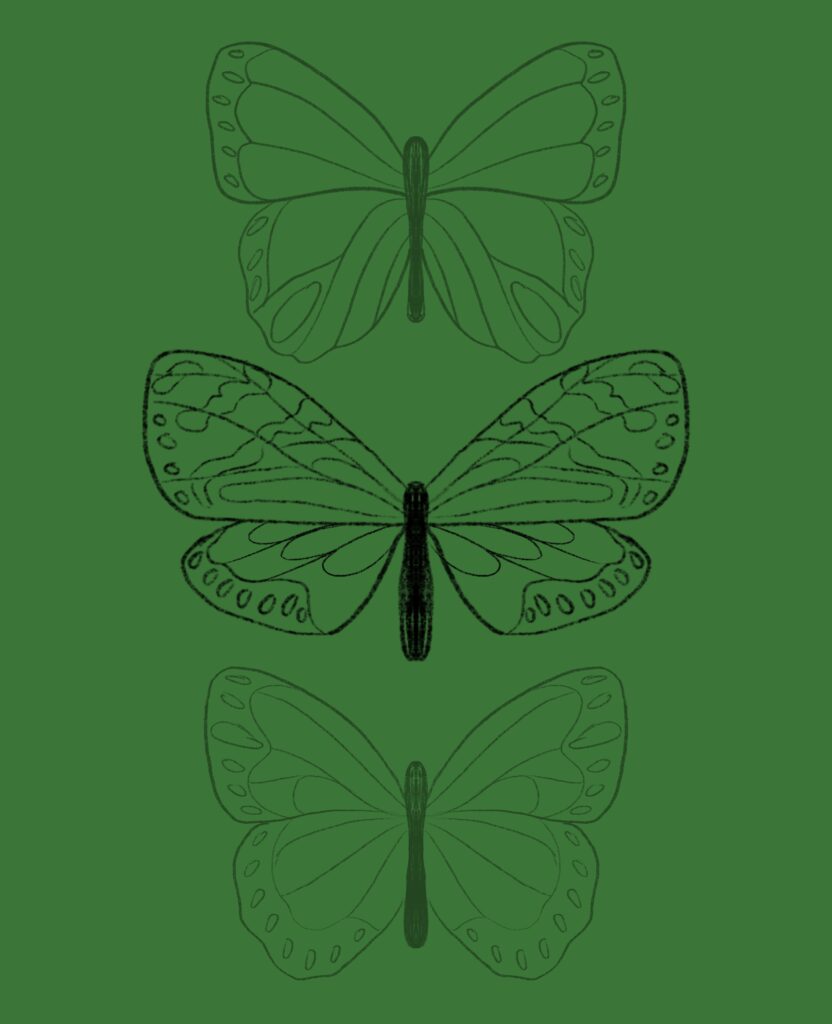
I started with rough sketches, working out the basic silhouette and wing shape for each species. This is where I make most of my structural decisions. How stylized do I want the form to be? How simplified should I make it?
For this collection I decided to do both, one piece I kept in more detail in the wing markings. The markings are the story with butterflies. Then I stripped the form away entirely to focus purely on shape. .
The sketches are loose and fast. I try not to be so precious about this stage. It’s just thinking with a pencil.
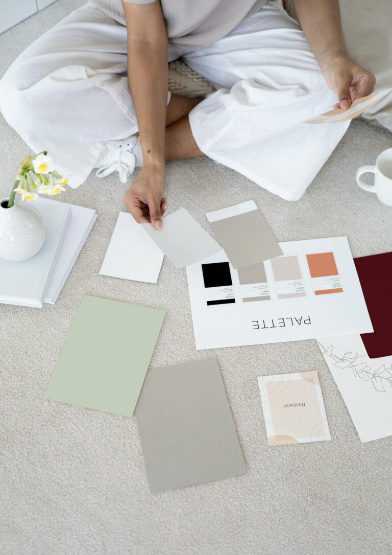
Building in Color
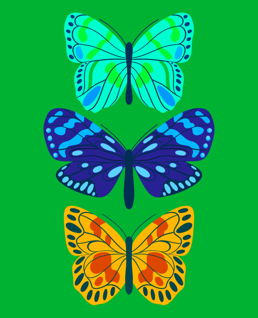
Color is where my work really lives, and this collection gave me a lot to play with.
Each butterfly got its own palette, but I designed them to work together as a set. The backgrounds are all the same bold green, and that was a deliberate decision to create cohesion across three very different pieces. Against that green, I could let each butterfly be its own color story.
I normally work with a limited color palette, usually five or six colors maximum. More than that and flat illustration starts to feel busy and unresolved. The constraint forces better decisions.
One thing I keep coming back to in my work is the idea that color should feel intentional and confident. No muddy mid-tones, or shapes too close in value.
Thinking About the Collection as a Whole
Once the individual pieces were close to final, I spent time looking at them together. This is a step I don’t skip. A collection needs its own internal logic and to work together like a giant puzzle.
I looked at visual weight across the three pieces. Size relationships. Whether the color stories felt complementary or competitive. I made small adjustments (shifted a background slightly warmer here, simplified a wing marking there) all in service of the set reading as a cohesive body of work rather than three unrelated illustrations.
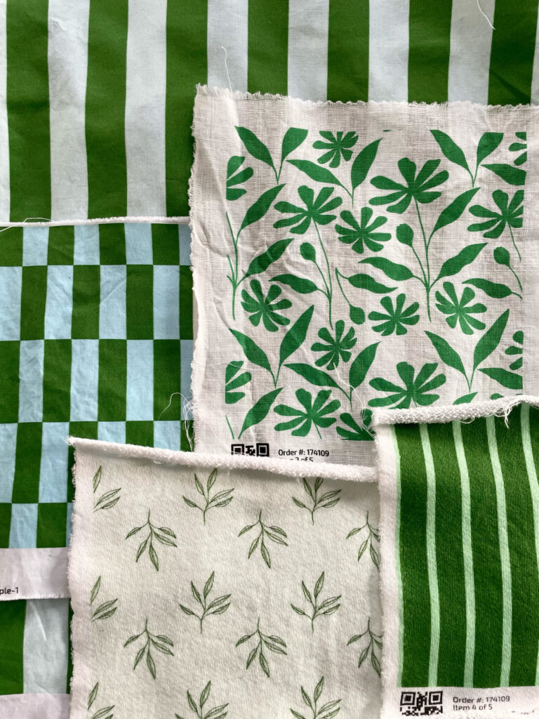
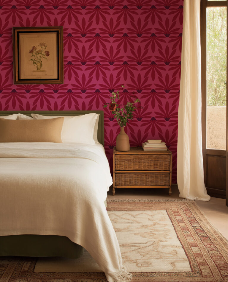
This is also where I think about how the work could exist in the world beyond a screen. A collection like this has an obvious life on paper goods, fabric, wallpaper, stationery. Thinking about those applications while I’m still in the final stages of a piece helps me make better decisions about scale, about how the composition sits within a frame.
What I Took Away
Every collection teaches me something. With this one it was about the relationship between complexity and restraint, how you can have both in the same piece if you’re intentional about where each one lives.
Nature has been my most consistent reference when it comes to my work. There’s always more to look at, more to simplify, and more to translate into a visual language that feels like mine.